Styling
Colour theory for beginners: matching tops and bottoms without thinking
Matching value and temperature, not memorising the colour wheel, is what actually makes outfits look coordinated with almost no daily effort.

The short answer: value and warmth matter more than the colour wheel
Most people think colour matching means memorising the colour wheel, but that is the hard way to a skill that is actually simple once you know the real rules.
Two things decide whether an outfit works: value, how light or dark a colour is, and temperature, whether it leans warm or cool. Get those two variables aligned and almost any colour combination reads as intentional, even ones that look risky on paper.
This guide breaks down the small set of rules that cover 90 percent of everyday dressing, without requiring you to think about hue families every morning.
Rule one: match value before you match colour
Value is how light or dark a colour is, independent of what colour it actually is. A pale yellow and a pale blue share a value even though they are opposite colours, and that shared value is why pastel outfits often look coordinated even when the colours themselves clash on a wheel.
This is the single highest-leverage rule in dressing. Two garments with similar value, both mid-tone, both dark, both pale, almost always look intentional together, regardless of hue.
The opposite is also true. A very dark navy top with a very pale cream bottom creates strong contrast, which reads as sharp and deliberate when done on purpose, but sloppy when it happens by accident because you grabbed the two nearest items in your drawer.
Practical test: squint at your outfit in a mirror. Squinting blurs hue and leaves only value, so if the pieces look balanced when blurry, they will look coordinated in focus too.
Rule two: match temperature, or contrast it on purpose
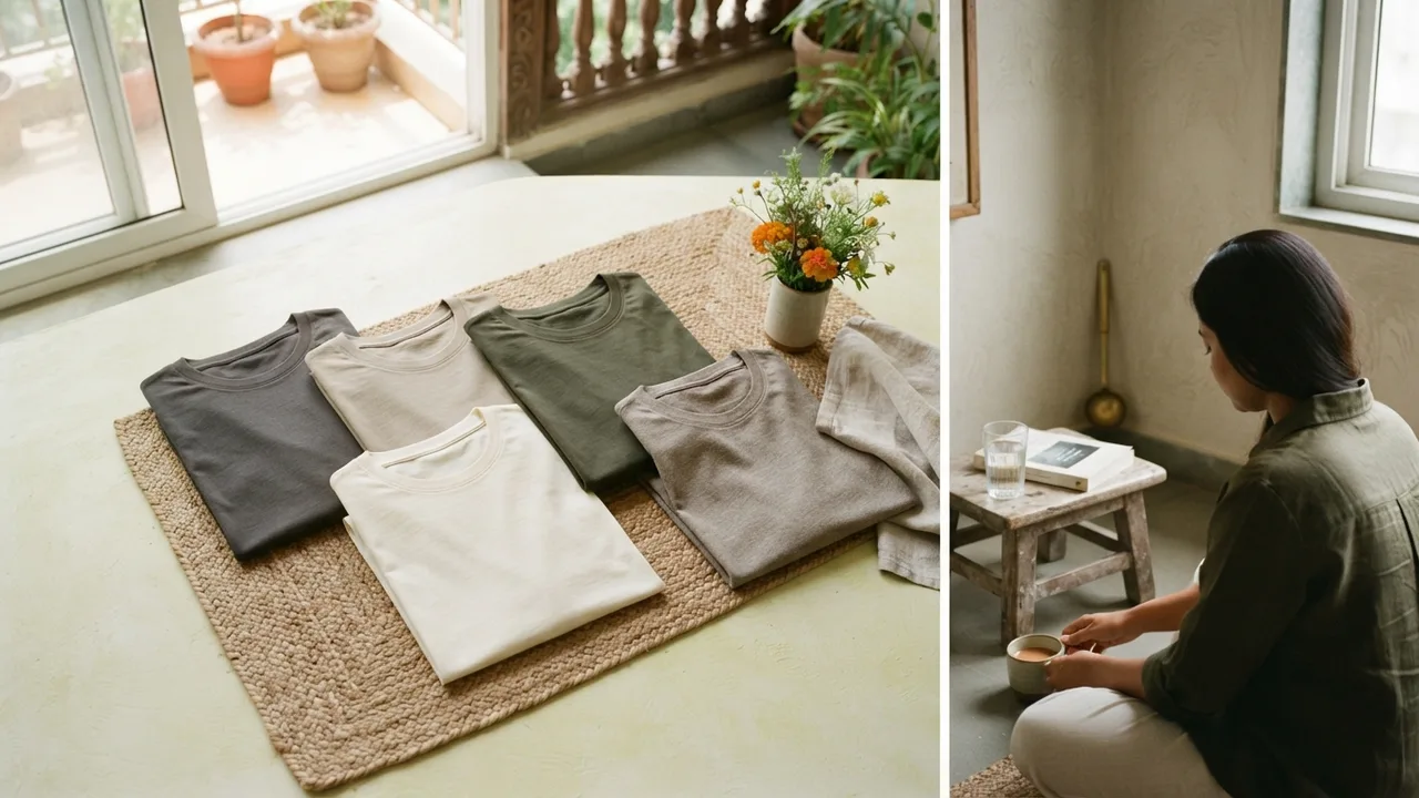
Every colour, including neutrals, has an underlying warmth or coolness. Charcoal grey can lean slightly blue and cool, or slightly brown and warm, depending on the exact shade.
Warm colours include colours with red, orange, or yellow undertones like olive, rust, and cream. Cool colours lean blue, green, or purple, like navy, slate, and true black.
Mixing warm and cool tones is not forbidden, but it needs to be a choice, not an accident. An olive tee with warm-toned tan chinos reads as cohesive because both pieces share the same undertone family. The same olive tee with cool-toned icy grey trousers can look slightly off, not because either colour is wrong, but because their temperatures fight each other.
If you are unsure which family a piece falls into, hold it next to a true white shirt in daylight. Warm pieces will look slightly yellow or orange against white; cool pieces will look slightly blue or grey.
Rule three: the 60-30-10 proportion rule
Once value and temperature are sorted, proportion decides whether an outfit feels balanced or busy.
The rule borrows from interior design: 60 percent of an outfit should be a dominant neutral, 30 percent a secondary colour, and 10 percent an accent. In practice, that usually means your trousers or bottom half carry the dominant tone, your top carries the secondary colour, and a small accessory, a watch strap, shoelaces, a bag, carries the accent.
This proportion is why an outfit with three or four colours worn in roughly equal amounts often looks chaotic, while the same colours in a 60-30-10 split look considered. The eye reads a dominant colour easily, but struggles when nothing is clearly in charge.
For a minimalist wardrobe built around tees, this usually simplifies further. Most days are closer to 80-20, a neutral top and bottom with one small accent, which is exactly the logic behind uniform dressing and why it works so reliably without feeling boring.
Rule four: neutrals are not optional, they are the foundation
A common beginner mistake is treating neutrals as boring filler and colour as where the real styling happens. It is the reverse.
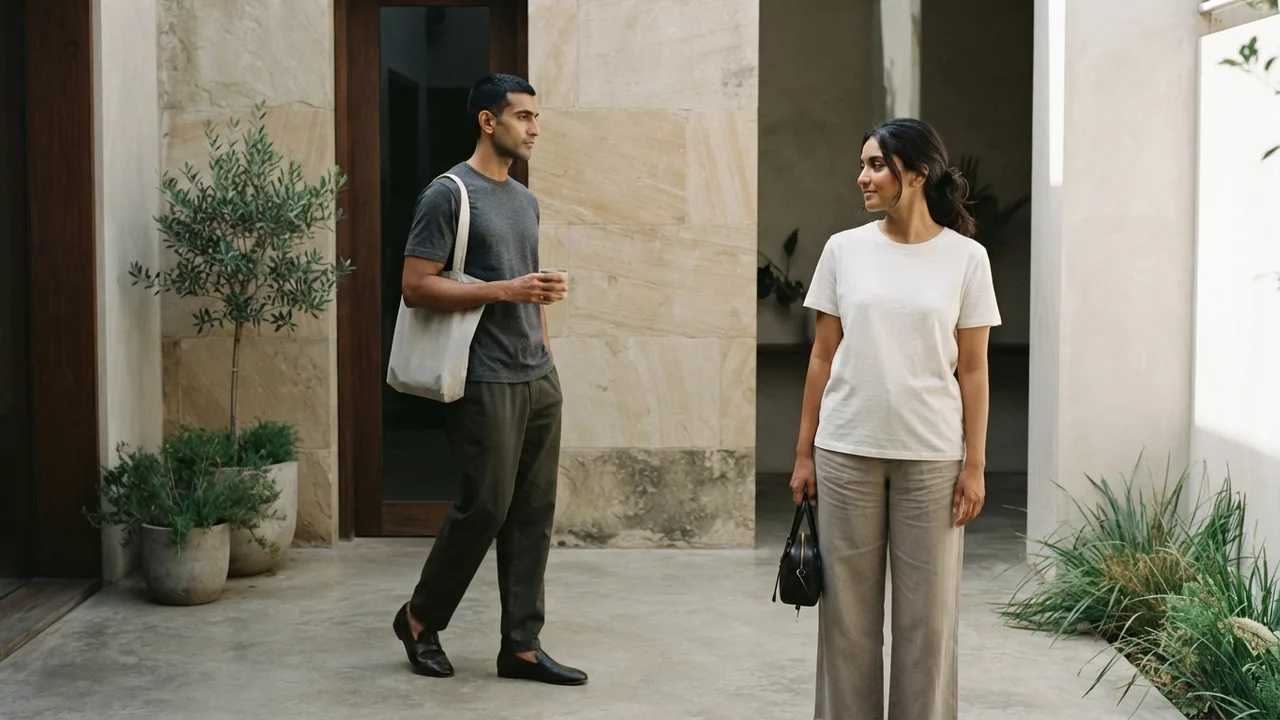
Neutrals, black, white, grey, navy, olive, tan, do almost all the work of making an outfit look put together. Colour is the accent that neutrals set up, not the other way around.
This is why essential t-shirt colours form the backbone of almost every functional wardrobe, and why building outward from a strong neutral base makes every subsequent purchase easier to match. If your base wardrobe is five reliable neutrals, adding one colourful piece a season is low-risk because it only has to work with a small, known set of items.
Rule five: monochrome is the easiest colour theory shortcut there is
If value and temperature matching feels like too much to track daily, monochrome dressing removes the decision entirely by using different shades of the same colour family.
A charcoal tee with black trousers, or a tan tee with warm brown chinos, automatically satisfies both the value and temperature rules because everything comes from the same family. This is genuinely the fastest way to look coordinated with the least thought, and it is why monochrome outfits consistently read as more polished than people expect from such a simple formula.
The one caution with monochrome is flatness. Vary the fabric texture or the exact tint slightly, a matte charcoal tee against a slightly darker charcoal trouser, rather than two pieces in the exact same shade, which can look like a uniform gone wrong rather than a deliberate outfit.
Matching colour to skin tone, briefly
Colour theory for outfits is not just about the pieces matching each other. It also interacts with your own skin's undertone, which changes which neutrals look most flattering closest to your face.

Warmer skin undertones generally suit warm neutrals like olive, cream, and rust more naturally, while cooler undertones lean toward true black, icy grey, and navy. This is not a hard rule, more a starting point, and our guide to t-shirt colours for Indian skin tones goes deeper into how to identify your own undertone and shop accordingly.
Putting it together: a simple decision framework
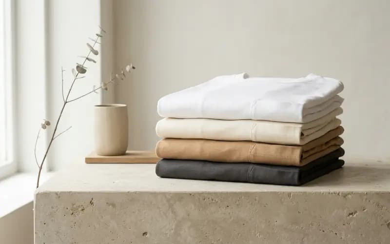
!Minimalist editorial photo illustrating warmer skin undertones generally suit warm neutrals like olive, cream, and rust more naturally, while cooler undertones lean toward true black, icy grey, and navy. this is not a hard rule, more a starting point, and our [guide to t-shirt colours for indian skin tones goes deeper into how to identify your own undertone and shop accordingly., muted neutral tones, soft natural light, premium plain t-shirt context](/images/blog/colour-theory-basics/inline-3.webp)
| Step | Question to ask | What to do |
|---|---|---|
| 1 | Is the value similar across pieces? | Match light-with-light or dark-with-dark by default |
| 2 | Is the temperature aligned? | Keep warm with warm, cool with cool, unless contrasting on purpose |
| 3 | What is dominant, secondary, accent? | Aim roughly 60-30-10, not equal thirds |
| 4 | Do I have a strong neutral base? | Build outward from five to six reliable neutrals |
| 5 | Am I unsure? | Default to monochrome, it is nearly foolproof |
A practical starter combination that always works
If you want one combination to fall back on while you build this instinct, a mid-tone neutral top with a slightly darker or lighter bottom in the same temperature family covers almost every casual and semi-casual situation.
A well-fitted round-neck tee in a neutral shade, paired with warm-toned chinos or cool-toned denim depending on the tee's undertone, is the combination this whole framework is built to produce quickly. It is not the most exciting outfit in your wardrobe, but it is the one that will not go wrong on a day you have not thought carefully about what to wear.
For pairing specific colours like olive, our guide on what goes with olive green applies every rule above to one of the trickier neutrals to style well.
The takeaway
You do not need to memorise the colour wheel to dress well. You need to notice value, notice temperature, keep proportions roughly 60-30-10, and lean on a strong neutral base.
Once those four habits become automatic, colour stops being a daily decision and becomes something you barely have to think about, which is exactly the point.
Boring Label
Wear the point of the article.
One honest tee. Heavyweight combed cotton, a collar that holds, a fit that actually fits. No logo, no noise.
Shop the round-neck teeFree shipping across India · Easy returns
Keep reading
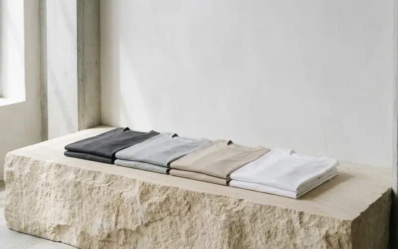
The Essential T-Shirt Colours to Own
Buy these colours in this order and every tee works with everything else you own.
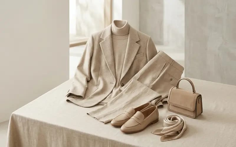
The Monochrome Outfit: A Simple Formula
Dressing in one colour sounds risky and is actually the easiest way to look pulled together.
Best T-Shirt Colours for Indian Skin Tones
Cream over stark white, olive over grey: the neutral tee colours that actually suit warm Indian skin, and how to build a palette.
Stay in the loop
New writing, no noise
Occasional notes on fit, fabric, and dressing simply well. No spam, unsubscribe anytime.
Subscribe