The Only Tee You Need
Supima Round Neck
Brand Kit
The Boring Label identity.
Everything you need to represent our brand correctly. Logo, typography, colours, and usage guidelines.
Logo
Our wordmark.
The Boring Label logo is a text-based wordmark. Always use Montserrat semibold (600), uppercase, with 0.08em letter spacing. Never modify the proportions, spacing, or typeface.
On dark backgrounds
On light backgrounds
Maintain a minimum clear space equal to the height of the letter ‘B’ around all sides of the wordmark. Never place the logo on busy backgrounds or at sizes smaller than 14px.
Typography
Three fonts. Nothing more.
Aa
Ovo
Headings & Display
- Serif
- Weight: 400 (Regular)
- Use for: headlines, quotes, product names
Aa
Montserrat
Body & UI
- Sans-serif
- Weights: 400, 500, 600
- Use for: body text, buttons, navigation, labels
Aa
Inter
Accents
- Sans-serif
- Weights: 400, 500
- Use for: small text, captions, metadata
Colour Palette
Intentionally restrained.
Our palette reflects our philosophy — minimal, sophisticated, and purposeful. Every colour serves a function.
Brand Colours
Charcoal
#1a1a1a
Dark Slate
#333b48
Medium Slate
#4c5460
Off-White
#f7f7f5
White
#ffffff
Muted
#999999
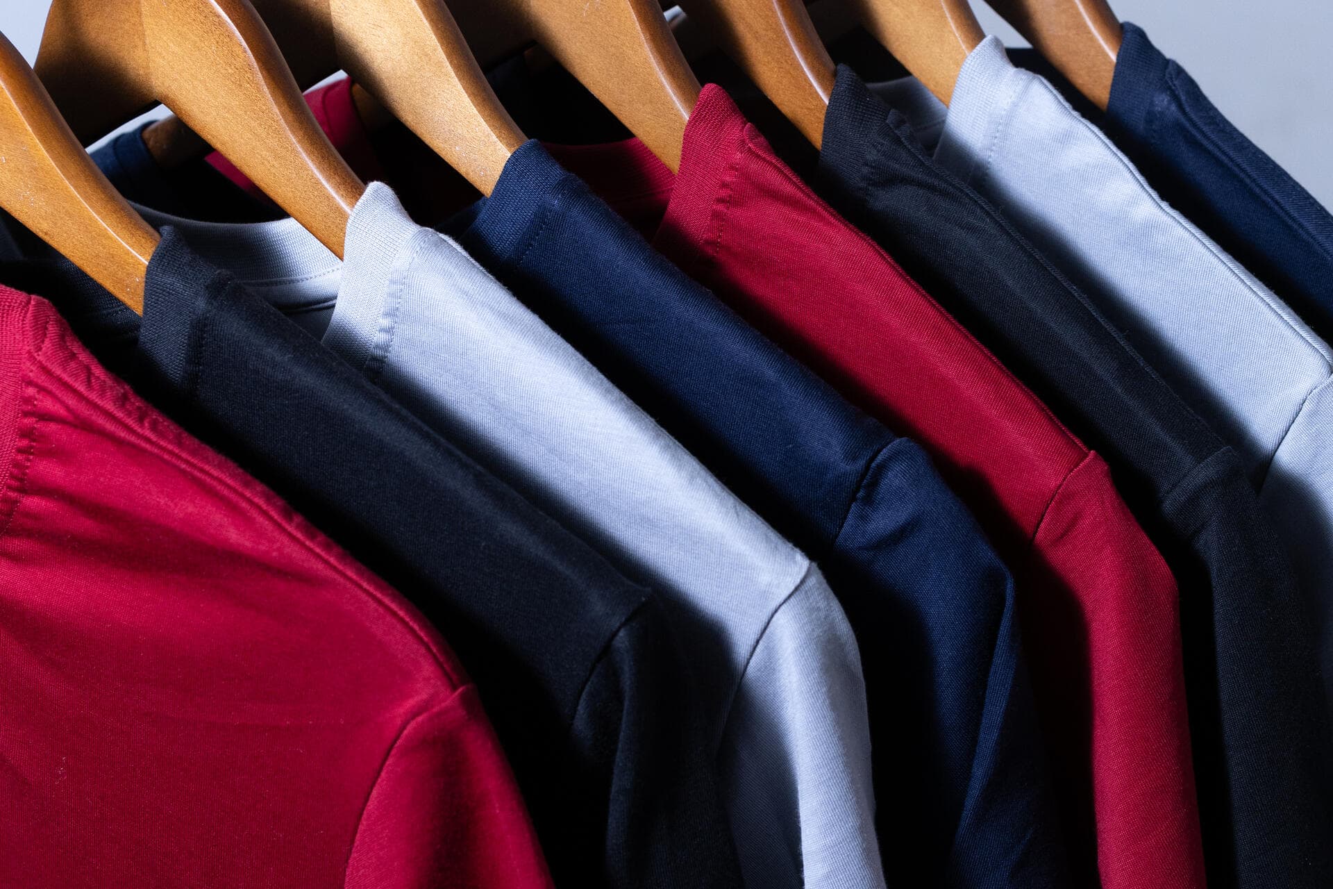
Product Colours
Black
#1a1a1a
Light Grey
#d4d4d4
Maroon
#5c1a1a
Navy Blue
#1e3050
White
#f5f5f5
Usage Guidelines
Keep it boring. Keep it right.
01
Never alter the wordmark
Don't stretch, rotate, add effects, change colours outside the approved palette, or modify letter spacing.
02
Respect the clear space
The wordmark needs room to breathe. Maintain minimum clear space equal to the height of the letter ‘B’ on all sides.
03
No logos on the product
Our garments carry zero external branding. The fabric is the branding. This is non-negotiable.
04
Photography style
Clean, minimal, white or neutral backgrounds. Natural lighting. Focus on fabric texture and fit. No heavy post-processing.
For brand assets and inquiries, contact
[email protected]